
What makes a software product truly successful? Is it enough for it to work correctly and meet the requirements? The answer is a resounding no.
Beyond functionality, the key lies in the user experience (UX). Software can perform every task it was designed for, but if using it is frustrating or confusing, it will hardly win over its users. This is where heuristic evaluations come in: a powerful tool to bring UX into the Quality Assurance process.
What are heuristic evaluations?
Imagine you are developing a mobile app. It works perfectly, but when you use it you notice that the buttons are too small, the menus are confusing and the design is inconsistent between screens. Those are usability problems a heuristic evaluation would easily detect.
Why integrate them into the QA process?
Traditionally, QA testing focused on verifying that the software met the functional requirements. Adding heuristic evaluations widens the scope to cover usability too, which makes it possible to identify UX problems early, when they are cheaper to fix.
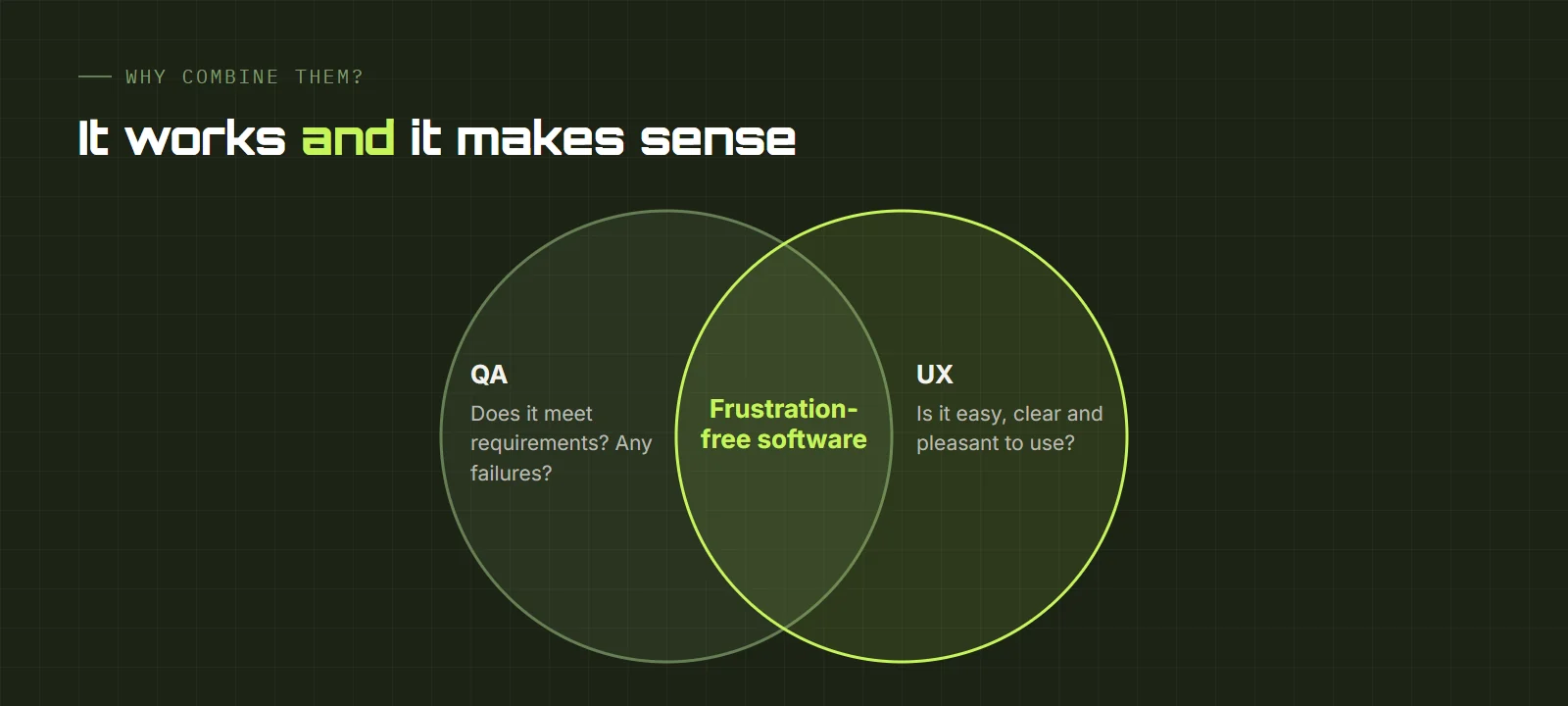
As Jared Spool, founder of User Interface Engineering, puts it, real users show you things you would never have anticipated, no matter how many heuristic evaluations you have done. That is why it is best to combine both techniques: heuristic evaluations quickly detect the obvious problems, and user testing reveals subtler difficulties. Together they give a complete view of the experience.
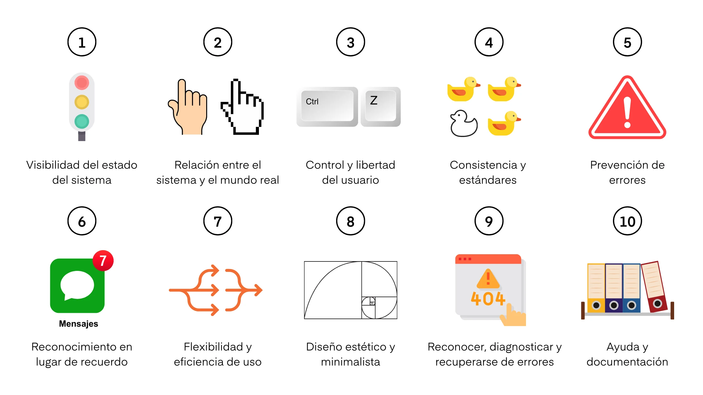
Nielsen's 10 usability heuristics
The most widely used heuristics were proposed by Jakob Nielsen, a usability pioneer:
- Visibility of system status: the system should keep users informed about what is going on, through appropriate feedback within a reasonable time.
- Match between the system and the real world: speak the users' language, with familiar words and concepts, rather than system-oriented terms.
- User control and freedom: users often choose functions by mistake and need a clearly marked exit to leave the unwanted state.
- Consistency and standards: users should not have to wonder whether different words, situations or actions mean the same thing. Follow platform conventions.
- Error prevention: even better than a good error message is a careful design that prevents the problem in the first place.
- Recognition rather than recall: minimize memory load by making objects, actions and options visible.
- Flexibility and efficiency of use: accelerators, unseen by the novice, that speed up interaction for the expert user.
- Aesthetic and minimalist design: interfaces should not contain irrelevant information; every extra unit competes with the relevant information.
- Help users recognize, diagnose and recover from errors: messages in plain language that state the problem and suggest a solution.
- Help and documentation: easy to search, focused on the task, with concrete steps and not too long.
How to run a heuristic evaluation
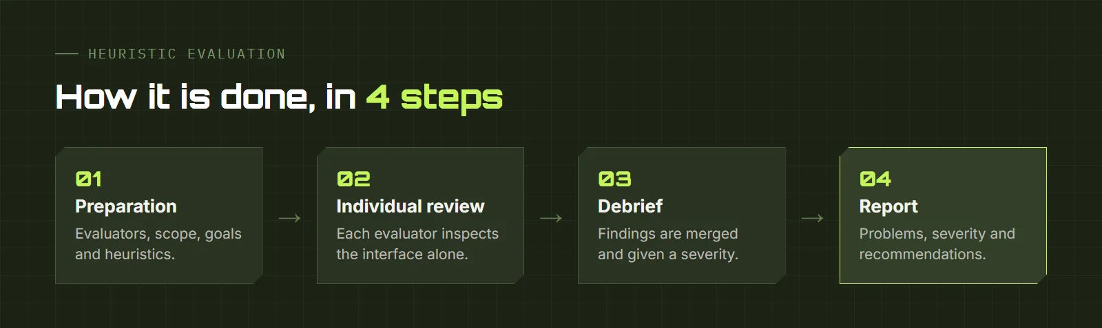
- Preparation: selecting the evaluators, defining the scope and objectives, and choosing the heuristics to apply.
- Individual evaluation: each evaluator examines the interface independently and notes the usability problems they find.
- Evaluation meeting: the evaluators consolidate their observations and assign a severity to each problem.
- Report: a report with the problems found, their severity and recommendations to fix them.
Heuristic evaluations are useful because they are relatively quick and inexpensive, can be done at any stage of development and provide a systematic way to identify and address usability problems that affect the user experience.